Wednesday, December 8, 2010
Graphic Novel Review
Review for: FURUBA (Fruits Basket, vol. 1)


For this I decided to read a graphic novel called Fruits Basket by Natsuki Takaya. It was first published in a magazine in January of 1999. It is a Japanese manga, black and white, drawn with pen and cel-shading. It has a pretty typical manga layout with multiple versions of quadrilaterals--characters and dialogue frequently are outside of frames which put most emphasis on them when reading through the page. There is an average of about 6 frames per page. The font is same throughout, size varying from dialogue bubble to bubble depending on how much is needed to fit. There are frequently large Japanese characters that usually represent sound effects which are translated at the back of the book. The dialogue boxes change shape for thoughts and exclamations. The background is usually a special effect when it is not the actual setting the characters are in, such as exploding lines coming from a yelling person or swirls in a weird or confusing situation. This novel is not visuals-driven because there is a lot of dialogue on each page to show what is going on between the characters. When the characters are not talking to each other, the main character is thinking to herself or there is some narration here and there.
The theme of this manga is typical of the shoujo genre: the dramatic life of a high school girl with boy crushes and all sorts of conflicts between them. The story usually takes place at the home of Sohma family or at the high school that the main character goes to. The main character’s name is Tohru Honda. She is orphaned after her mother dies in a car accident and tries to support herself by living in a tent, mistakenly on the Sohma’s property. When the Sohmas find out she is living there, they invite her to live with them. The three people who are already living there are all males. One of them is the considered the “prince” of the high school—every girl wants to go out with him. The interesting part of the plot is that Tohru finds out the the Sohma family is possessed by the animals of the Chinese zodiac. If a person of the opposite sex hugs them, they turn into the animal they are each possessed by. Each has the personality of the respective zodiac sign. This is a big family secret that Tohru has to keep to herself. The story is told from Tohru’s point of view and is the present tense of her life. The story is almost completely focused on her.
The tone of the book is usually pretty light-hearted, fun, and dramatic. There’s a sense of mysteriousness, too, around the zodiac characters that Tohru slowly finds out more about.The story relies on very few flashbacks and the past is usually told in simple dialogue. If there is a flashback, it’s only an image or two and happens only a few times in the first book.
There isn’t much conflict in the first book, but there are hints that there is a lot more to the zodiac characters and seems that there is something dark going on between them. There is a pretty wide range of personalities in the characters. Tohru is typically quiet, nice, and tries hard not to be in people’s way. She’s a likeable main character. Her presence has an impact on the Sohma residence and sort of brings harmony to the 3 men living there. I chose this graphic novel to read because it is the one of the best-selling manga series in Japan and I’ve heard of it many times on the internet. I thought it was very well done, both story and graphics. The characters and their interesting interactions, as well as the mysterious background, are what keep you reading more. The story definitely has some silly things going on that bring in some interesting twists and funny situations, such as the zodiac animals changing back into humans completely naked, and Tohru lives with 3 men. I really liked that the pacing of it was quite perfect. There was always enough reflective down time between conversations and action. While the story wasn’t exactly life changing as much of it didn’t involve any observational learning, it was really fun to read/look at and I liked the whole book. I will definitely continue the series and hope that it only gets better as I get more attached to the characters and get into the plot.
Monday, November 8, 2010
Tuesday, October 26, 2010
You've Got Mail Storyboard
Composite of stock images, textures, and vectors. Illustrator/Photoshop. Comic Life wouldn't load my images...
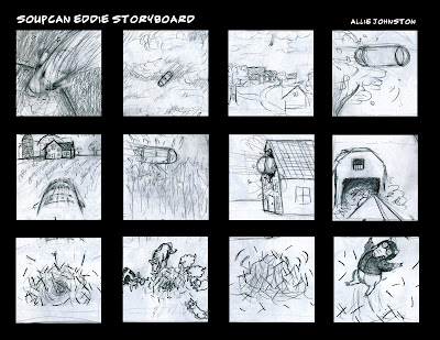
Soupcan Eddie
Animatic video
Shot list:
1. Oversized soup can with dome lid flying through space, heading towards earth’s atmosphere.
2. Soup can goes through layers of clouds.
3. Soup can can be seen from the ground. It comes flying towards the ground at a shallow angle.
4. Soup can leaves a dust cloud behind it, swooping around any high obstacles.
5. Soup can approaches a house and barn in the distance.
6. Soup can goes through corn, corn flies everywhere.
7. Soup can storms through top of house through window.
8. Soup can goes through the house towards the barn
9. Soup can lands in haystack.
10. Animals gather around the haystack.
11. Haystack rustles.
12. Eddie pops out of the haystack, hay flying everywhere.
Graphite, sketchbook, Windows Movie Maker.
Tuesday, September 28, 2010
Examples
Good graphics:
The second picture of airplane safety is an example of poor quality of graphics. All procedures are indicated according to one drawn picture, so it is very jumbled and it makes you want to read all the steps at once. Many aspects of the safety related to the chair are not explained well and someone may not know how to use them correctly. Also, it is strange and inconsistent that the seat belt is explained in opposite diagonals of the picture. The fact that there are a bunch of arrows going all over the chair also makes your eye go around everywhere and does not have a good order of reading. Also it is weird that they use two different styles of graphics between the chair and the "take off and landing" and the "no smoking".
I found an example for both good and bad graphics that explain airplane safety. The first is a demonstration of good graphics. The reading order is very comprehensible as it is left to right and then top to bottom for each set of directions. The drawings clearly indicate important steps in the procedures by dividing steps into frames, zooming in at some parts, as well as picturing what not to do for comparison. The style is of cartoon quality but all proportions are accurate to compare to real life and make you take it more seriously.
Bad graphics
The second picture of airplane safety is an example of poor quality of graphics. All procedures are indicated according to one drawn picture, so it is very jumbled and it makes you want to read all the steps at once. Many aspects of the safety related to the chair are not explained well and someone may not know how to use them correctly. Also, it is strange and inconsistent that the seat belt is explained in opposite diagonals of the picture. The fact that there are a bunch of arrows going all over the chair also makes your eye go around everywhere and does not have a good order of reading. Also it is weird that they use two different styles of graphics between the chair and the "take off and landing" and the "no smoking".
Monday, September 20, 2010
Subscribe to:
Comments (Atom)


